Here’s what you can do to display a shopping cart on mobile.
Navigate to Appearance > Widgets and place the Theme_name WooCommerce Dropdown Cart widget from the list of available widgets into the appropriate mobile widget area.
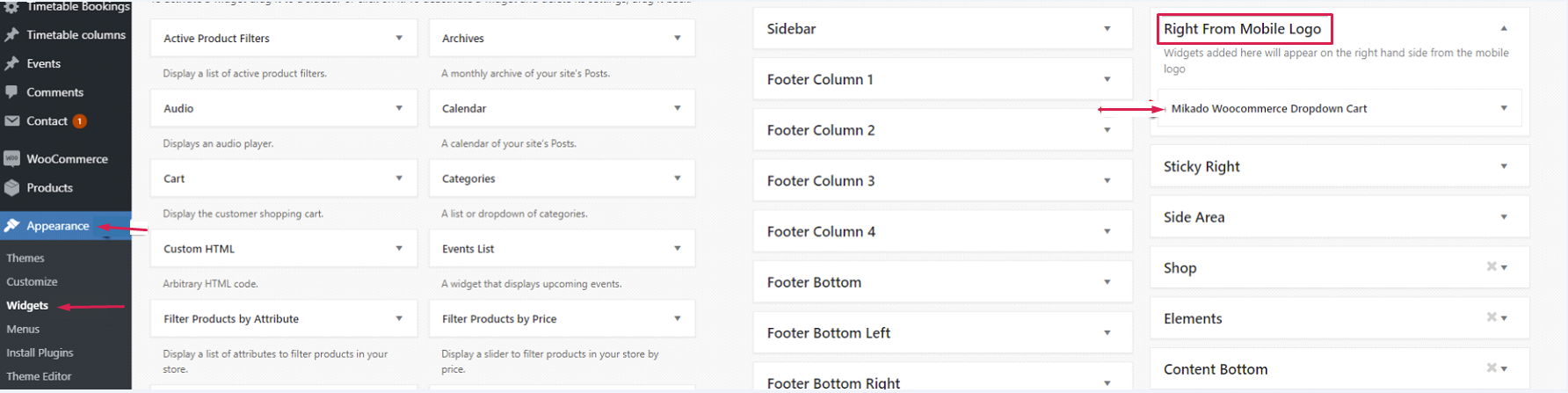
Depending on the theme, the name of the widget can also bear the author profile name, e.g. Mikado WooCommerce Dropdown Cart.
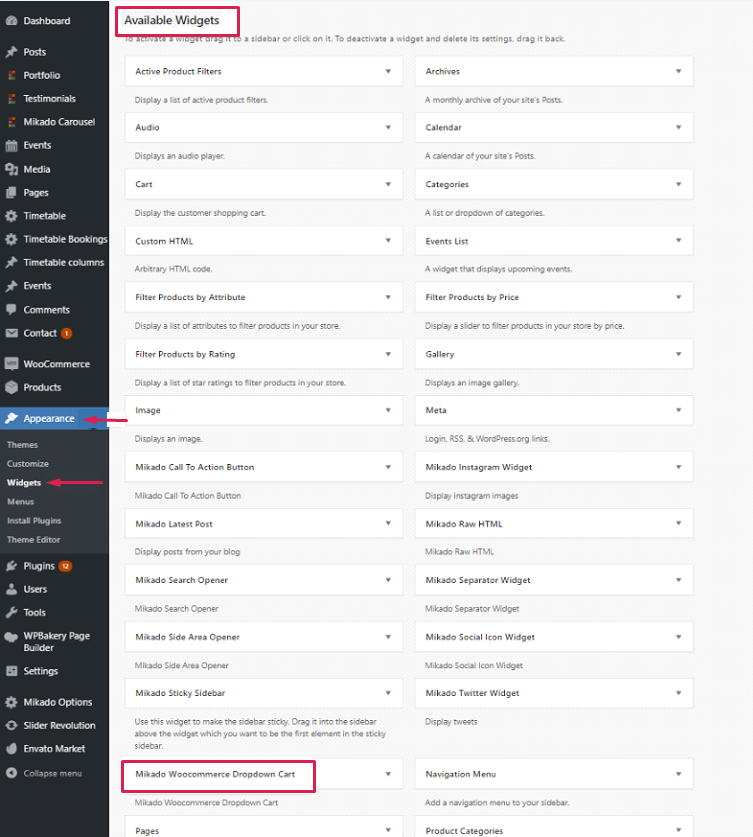
As we mentioned above, the widget will more commonly contain the name of the theme itself (e.g. Tetsuo WooCommerce Dropdown Cart). The way this widget is labeled actually makes no difference, as long as it is a WooCommerce Dropdown Cart widget.
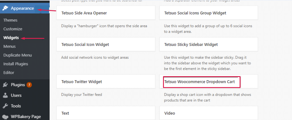
Furthermore, the widget area names also vary from theme to theme. It could be called Right From Mobile Logo, Mobile header Widget Area, or Mobile Area, in some instances.
In the case that a theme doesn't have a designated mobile widget area, we offer 2 possible workaround solutions:
⋅ A - Adding a link to cart page as one of your menu items.
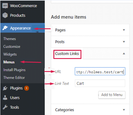
⋅ B - Adding the cart widget in the Top Bar, i.e. one of the Top Bar widget areas, for example Header Top Bar Right Column widget area.

Of course, this solution requires that you have the Top Bar area enabled, either in global options:
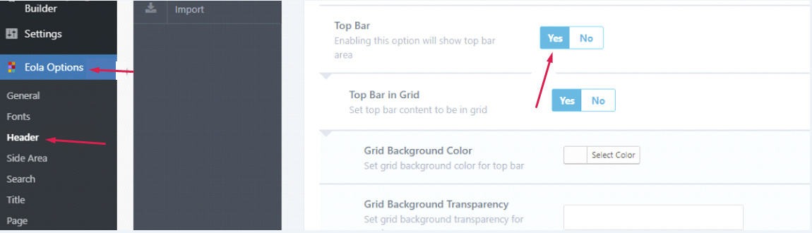
or the page options for the page in question:
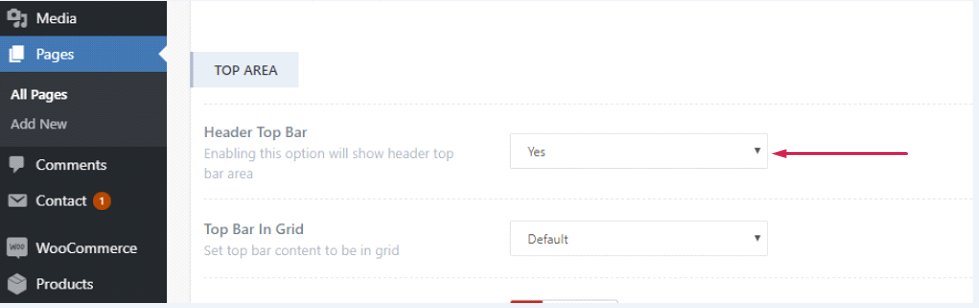
The last step is adding this piece of code to Appearance > Customize > Additional CSS.
@media only screen and (max-width: 1024px){
  .mkdf-top-bar {
  display: block;
  }
  }
Note: The custom css might require a prefix (mkdf) changes, depending on the theme.
The prefix can be seen by inspecting the element using the browser inspector.
Right click the element of your choice, in this case it’s the Top Bar, and click inspect.
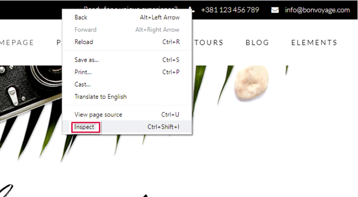
The prefix can be seen inside the class of the corresponding div container.
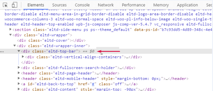
Therefore, in this case mkdf should be changed to eltd , and the following code should be inserted:
@media only screen and (max-width: 1024px){
    .eltd-top-bar {
    display: block;
    }
    }