The breakpoint for mobile menu is at 1000px – 1024px screen width, depending on the theme. This is unfortunately not something that can be altered via theme options.
Overlapping of the logo and menu items usually happens due to a large number of items in the menu and/or the logo being too wide, but these issues can be resolved by adjusting the padding or margins as well as the font size of menu items.
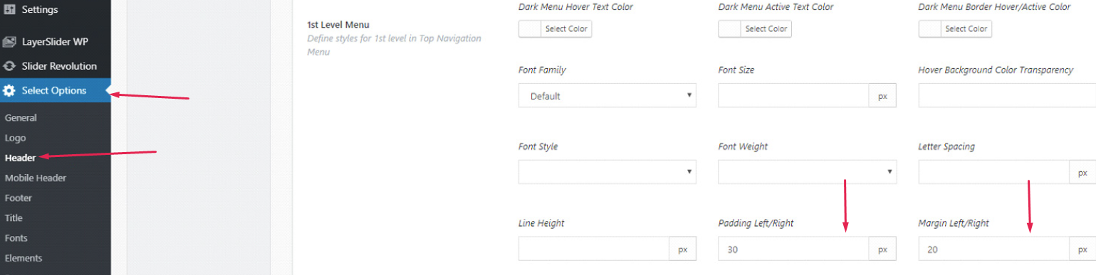
In some themes, this can be done through theme options in Theme Options > Header > Main Menu:
In other themes, these options are unfortunately not available, but the same effect can be achieved through custom CSS. The following code reduces the padding, margin and font size for menu items when screen width reaches a certain point:
@media only screen and (max-width: 1200px) {
nav.main_menu>ul>li>a {
 padding: 0 12px !important;
 margin: 0 10px !important;
 font-size: 20px !important;
}
}
In the first line, the value of max-width determines at which width these rules will be applied - in this case, it is at 1200px.
The next line targets the menu items. This line will be different depending on the theme, namely the profile it was published by:
nav.main_menu>ul>li>a – Qode themes
.eltdf-main-menu>ul>li>a – Elated themes
.edgtf-main-menu>ul>li>a – Edge themes
.mkdf-main-menu>ul>li>a – Mikado themes
.qodef-main-menu>ul>li>a – Select themes
The lines within the brackets determine the values of padding, margins and font size respectively. The first number in the margin and padding refers to top and bottom margin/padding, and this is why it is set to zero, while the second number refers to left and right margin/padding and here you can input your desired value.
Adjust the code as needed and paste it to Appearance > Customize > Additional CSS.